After a stressful beginning to B-Term the team has managed to finally get a working desktop AIR build running at a less-than-ideal but manageable framerate. This is going to open new doors to start the process of getting the build running on a mobile device (most likely Android first). It's also going to allow the artists to start making the necessary adjustments to assets in the FLA in order to get everything looking as it should on the stage. This includes centering animations, proper timing for transitions, and resizing and arranging elements in their proper place.
This is great and exciting news and things are looking up for the team to deliver a reasonable end-product at the end of this term.
Our major obstacle is going to be optimization so that we can get the game running flawlessly, which is going to be collaborative task for both the art and tech teams.
Saturday, November 5, 2011
Thursday, November 3, 2011
Initial Comps
The next step from the sketches that Mike and I did were to translate them into simulated screenshots using existing game assets. This would allow us to get a very clear sense of how elements would look and be arranged on the screen.
We regularly exchanged these comps with Picturiffic's artist, Shiho. She would provide us with critical feedback which eventually narrowed down our designs to what the screens that we would actually use in game.
One struggle Mike and I had was adhering to the company's art treatment in the initial stages of comping. This was sort of an exciting real world, industry experience where we had to adhere to certain guidelines to maintain the intended style and feel of the game.
Below is a sort of timeline of the changes that the comps went through. They are primarily focused on the home and daily puzzle screen which were the two most prominent screens that would be featured in our mobile application.


This is a critical point in the comping stage where it was brought to our attention that we were straying away from the artistic style of Picturiffic. I think it's evident that we made the drastic changes in our approach to these next designs that were necessary to adhere to the Picturiffic Style.


These are the initial comps that I shared with Shiho for the actual game play screen as well as an idea for displaying the leaderboard in a limited space.

This settings menu is an implementation of an idea that I had which was to strip all of the player information off of the puzzle screen and dock it in the settings menu. My reasoning behind that was that I didn't believe that this information was critical to game play and would be more appropriate to show up after the puzzle had been completed or failed to show gains in energy, diamonds and level.
In the comp below I tried to implement the leaderboard in a way that would conserve more real estate. In the original version of Picturiffic the leaderboard chunks had tabs that would pop up when other users made their guess. Those tabs would also indicate whether or not their guess was right or wrong after the player made their choice. I took this notification system and instead of using tabs I implemented a glowing effect around each leaderboard chunk which would save vertical space. The different colors indicate whether or not the player has made a guess (blue) and whether that guess was right (green) or wrong (red) I also rearranged the elements on the leaderboard chunks so that they would still read well in their limited space.

This comp below is a redesign of the previous puzzle screens from above which implements the feedback that I received from Shiho. It aims to clairfy the functionality of the leaderboard as well as rearrange elements like the hearts to make them seem more like an element of gameplay rather than a decoration.

Finally, after a few rounds of revisions and suggestions from Brad and Shiho at Large Animal Games we settled on this home screen design for the mobile build. It manages to make the Daily Puzzle the most prominent mode of play on the screen. Similarly, the gameplay mode and create a puzzle mode manage to still look appealing and inviting without overwhelming the users visual field. We also clarify the timer and make it relatable to the daily puzzle and only the daily puzzle. Most importantly it achieves the look and feel of the original Picturiffic game.

Tuesday, November 1, 2011
Early Research into Animation Tools
When the project began, we were initially planning on working with HTML5. Since it was relatively new, we were unfamiliar with the tools required to create working animations that we could use in an HTML5 application. We found several tools that claimed to work with HTML5 animation, but most of them had little to no useable interface, and we had been hoping for some level of user-friendliness.
Two of the tools stood out from the rest; Adobe Edge and Sencha Animator. Both seemed to have a user-friendly interface and both were established brand names within the animation community, and both seemed like they could do what we needed them to.
Adobe Edge was the first tool we looked at. Since it was designed to be very similar to the familiar tool Adobe Flash, it seemed like a logical choice. Upon further inspection we found that it was limited in terms of the effects and animation capabilities available within the program, which could hinder the overall quality of our final product. In addition, Adobe Edge was still in experimental stages, meaning it could be drastically altered at any time without notice. This could've led to many headaches and possibly weeks of wasted work, so we scrapped the idea of using it as our tool of choice.
Sencha Animator was our second choice. Its interface was slightly less intuitive than Adobe Edge's, but we found that it had far more effects and animation capabilities than Adobe's product. We ran into problems when we attempted to export the animations, which could only be done via style sheets in CSS3, and we couldn't find a way to manipulate them in response to user input like what is needed for a game.
The final option was procedural animation, meaning the creation of a series of static images that would be put together into an animation by the code. This method was unfavorable for both the art and the tech team, and it meant that a lot of time for both teams would be used up dealing with optimizing or tweaking the animations after they were made. Because we didn't know how difficult it would be to optimize the performance of the animations, this method was a big question mark in terms of the amount of work required to make the game.
Early UI Comps
These are some of the first compositions of the screens that I created, mostly using existing assets. The choice to use the actual game assets rather than gray box shapes was to give a better sense of what the final design would look like. While our previous compositions had been focused on getting spacial reference for the screen size, these were exploring other equally important aspects of the UI design.
Home Screen 1

This is a menu style for the home screen that was experimenting with the facebook version's more exciting visual features. It utilizes the diagonal lines to evoke a more dynamic and energetic feeling. The color contrast between the three main sections was not exactly well implemented and needed rethinking. Overall it felt too haphazard and sloppy to be visually appealing, so major changes needed to be made.
Home Screen 2

This composition was a revamp of the previous layout. The general idea was kept, but the coloration and size differences for the three sections were tweaked to attract the player to the Daily Puzzle and Game Show sections, rather than the Create-A-Puzzle. Even with these changes, it didn't work as well as it could've. We decided this comp was not going to be used in the final product, but aspects of it may have made their way into future builds of the game.
Daily Puzzle Screen 1

This was the first of several compositions primarily focused on arranging the leaderboards in a way that would save screen space while still creating a sense of community for the players. This comp did a fine job of saving space by removing the player portraits and collapsing the leaderboard information into small tabs, but the community aspect was greatly diminished because you couldn't see the other players' faces. We didn't want to reduce the other players into numbers and letters, so this level of leaderboard reduction was scrapped.
Daily Puzzle Screen 2


These two compositions brought back the player portraits for the leaderboards, and also toyed with the placement of the options button and menu. By removing the diamonds, energy and experience counters from the top navigation bar, we had more room to show the puzzle and phrase necessary for gameplay. At the same time, the options button was shifted to the middle to see if the symmetry would be more appealing. While the button itself might've worked in the center, once it expanded into the other buttons and display it was too unwieldy to consider as a viable option. In addition, it was decided that the player portraits were too small and needed to be expanded for the final product.
Daily Puzzle 3

In this comp, the options button was returned to its original location and the player portraits were enlarged. In order to save space on the leaderboards, player names were removed. The idea was that players would be able to recognize their friends without the names, and the picture was enough to convey the sense that you were playing along with other human players. The final change from the last comp was the rethinking of the Revive hearts, Move Arrow, and Reveal Letter buttons. The old way of having a circular button next to the explanatory text was far too space-hungry to fit comfortably amongst the other screen elements. They retained their circular shape while being absorbed into a larger rectangular button along with the text. This saved space and allowed the buttons to be a more comfortable size for pressing on a mobile device. The main problem with this design was the abundance of wasted space around the buttons and the puzzle picture, which was counteracting our efforts to save space with the rest of the design.
Early UI Sketches
These are some of the early UI Sketches I did. I chose to use basic gray box shapes and simple sketches so that I could visualize the relative spatial arrangements and relationships between elements on the different screens. As more original assets became available I started implementing them into the designs. Eventually I began making fake screen shots called comps that fully integrated actual assets from the Facebook version of Picturiffic. I'll make a post in the near future similar to this one which shows the designs and the implications behind them.
Home Screen 1

Home Screen 2 and what I call Home Screen "2.5"


These are some basic tile behaviors that I thought would be effective. I definitely thought that increasing their size and appearance accomplished two things. First, it gave the tiles a more interactive and responsive functionality. It also avoided the issue of the user covering up the tile letter and possibly forgetting what they might have chosen or maybe they would realize that's not the letter they wanted. It allows the player to "think" with the tile in a way. These design choices definitely stemmed from the interfaces of Words With Friends and the iPhone (keyboard).
Ghost Players and Leaderboard


Home Screen 1

This is a simple menu option that imitates the layout for games like Text Twist 2 and Angry Birds.
- There are three main menu elements, one for the daily puzzle, the game show and create a puzzle.
- Centered below them are three non-specific buttons that would operate as the home, settings and invite a friend actions.
- This layout is pretty standard, making it pretty intuitive. It’s not the most exciting design but it does serve its purpose well.
- One drawback is the amount of real-estate it doesn’t use.
- We would also have to rearrange recurring buttons (home, settings) on the game screen.
- NOT CONSISTENT WITH FACEBOOK
Home Screen 2 and what I call Home Screen "2.5"


- These two layouts are fairly similar in design. Rather than separating the elements on the screen this approach attempts to unify them.
- Similar to the daily puzzle and gameshow screen in the Facebook version
- The other buttons would serve as a collapsible settings menu (sound, home, etc…) and the other as a friend invite button.
- The sketch on the left is a bit more consistent in its design as we may be able to leave the settings and friend buttons where they are.


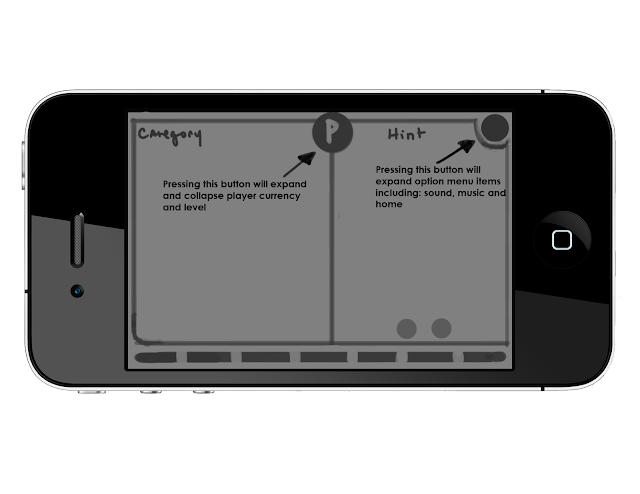
- This UI design is all about collapsing menus.
- The ‘P’ in the center is a button that, when pressed, will expand out (shown in second picture) and display player information (diamonds, energy, level). After a period of time the display will collapse back in on itself.
- The options menu has the same functionality. Rather than just nesting settings options in this we also planned to include the home button. The charms, puzzle layout and hearts would remain in the same locations that they appear in on Facebook.
- This layout gives us a bit more room to display the puzzle and phrase.
- One concern is ambiguity – does the center button even present itself as a button?

- This UI design avoids hiding the player information but consolidates the room each item takes up.
- By superimposing their values on top of the image we reserve screen space and create a more tidy look.
- The option menu would still feature the vertically collapsing function, but the home button would be separate.


These are some basic tile behaviors that I thought would be effective. I definitely thought that increasing their size and appearance accomplished two things. First, it gave the tiles a more interactive and responsive functionality. It also avoided the issue of the user covering up the tile letter and possibly forgetting what they might have chosen or maybe they would realize that's not the letter they wanted. It allows the player to "think" with the tile in a way. These design choices definitely stemmed from the interfaces of Words With Friends and the iPhone (keyboard).
Ghost Players and Leaderboard

- This has been the most challenging aspect to incorporate into the UI.
- Our best solution is as follows:
- At the start of the game we will display each player ‘card’ with a picture, their name and their level.
- When the puzzle starts those cards will collapse into tabs that have a guess indicator ‘light’ as well as the players name and their score. We felt that including their level wasn’t necessary and took up much needed space.
- As far as displaying the leaders themselves we had two solutions:
- Use a gold, silver and bronze glow effect to indicate 1st, 2nd and 3rd place
- Similar to the Facebook version, incorporate the literal message 1st (etc...) into the player tabs.
Summary Screen

- The summary screen would function and look similar to the “bragging rights” screen in the Facebook version. Though, it would include some more information including:
- XP gain, Diamond’s earned and the top 3 players for that puzzle, along with a gratifying picture to congratulate the user for their success.
- This would limit the amount of exclamations that would have to be made after the puzzle is completed.
Vector versus Bitmap
Another issue the art team needed to research were the benefits of using vector versus bitmap graphics. Since mobile devices are far less powerful machines than today's computers it was necessary to determine what graphic format was going to yield the best performance and at what cost. It was also an important question because we were interested in supporting multiple resolutions (devices).
I (Kyle) researched the pros and cons of each format and found some interesting facts. After reading several articles I decided that it would be interesting to create my own experiment, comparing basic shapes and images in Photoshop, one set being vector and the other bitmap.

One issue with vector images that was later discussed was their ability to maintain peak performance. Since they are comprised of algorithms which draw the exact lines and curves that make up the image, it's possible that they would demand too much memory and debilitate performance.
In the end it seemed like using both formats would be necessary, as each had a certain give or take to them. More visually prominent elements would benefit from being vector images so that they would scale nicely from device to device, while less prominent visuals (that could afford to suffer a loss in quality without being to noticeable) could be converted to bitmap images.
References:
http://designwashere.com/design-battle-vector-vs-raster/
http://www.graphicdesignforum.com/forum/showthread.php?t=41
http://www.hiland.com/knowledge_base/helpful_hints/bitmap_vector_images_understanding_difference/
User Interface Research
Some of our (Kyle's and Mike's) initial research was focused on user interface design, specifically for mobile devices. Since we would be dealing with a much more limited screen space rearranging the UI for Picturiffic was going to be necessary.
In order to get an idea of different mechanics and tricks we could use to make up for the reduced size of mobile devices we decided that by playing popular mobile titles we would be able to assess what types of features we could integrate nicely with the existing Picturiffic UI. We played a multitude of games including Angry Birds, Plock!, Text Twist 2, Hanging with Friends, and Words With Friends. The goal was to absorb the interface of each game and determine how different features felt to us in terms of things like usability, ease of access as well as how screen real estate was managed.
Below are a series of screen shots that include the analysis of different elements of each game's user interface.
Text Twist 2

Another feature that we were unable to find a screen capture for was the menu screen. It allowed you to select space outside of the actual menu while still informing you of your selection with a highlighted bar.
Words With Friends

Hanging With Friends

We can manipulate and extend screen real estate by putting non-critical information for game play in separate drop down menus that are accessible from the game play screen.
Plock!

Angry Birds

- Collapsible menu buttons
- Simple animations to convey a liveliness to the buttons
- No major button behaviors
- There are no major differences in the UI layout between android and PC (chrome version)


Angry birds does a good job of compartmentalizing chapters and levels. This feature could be very useful for nesting categories in episodes. They also utilize the swiping motion to extend the amount of information that can be displayed on one screen, like the chapter selection.
Having a good sense of techniques used by other leading mobile developers we would go on to create sketches and "comps" that integrate said techniques into Picturiffic.
Subscribe to:
Posts (Atom)