Tuesday, November 1, 2011

Early UI Sketches

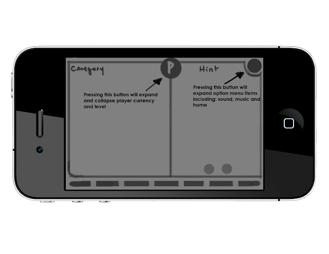
These are some of the early UI Sketches I did.  I chose to use basic gray box shapes and simple sketches so that I could visualize the relative spatial arrangements and relationships between elements on the different screens.  As more original assets became available I started implementing them into the designs.  Eventually I began making fake screen shots called comps that fully integrated actual assets from the Facebook version of Picturiffic.  I'll make a post in the near future similar to this one which shows the designs and the implications behind them.


Home Screen 1


This is a simple menu option that imitates the layout for games like Text Twist 2 and Angry Birds.
  • There are three main menu elements, one for the daily puzzle, the game show and create a puzzle.
    • Centered below them are three non-specific buttons that would operate as the home, settings and invite a friend actions. 
  • This layout is pretty standard, making it pretty intuitive.  It’s not the most exciting design but it does serve its purpose well. 
  • One drawback is the amount of real-estate it doesn’t use.
  • We would also have to rearrange recurring buttons (home, settings)  on the game screen. 
    • NOT CONSISTENT WITH FACEBOOK


Home Screen 2 and what I call Home Screen "2.5"

  •  These two layouts are fairly similar in design.  Rather than separating the elements on the screen this approach attempts to unify them.
  • Similar to the daily puzzle and gameshow screen in the Facebook version
  • The other buttons would serve as a collapsible settings menu (sound, home, etc…) and the other as a friend invite button.
  • The sketch on the left is a bit more consistent in its design as we may be able to leave the settings and friend buttons where they are.


  •  This UI design is all about collapsing menus. 
    • The ‘P’ in the center is a button that, when pressed, will expand out (shown in second picture) and display player information (diamonds, energy, level).  After a period of time the display will collapse back in on itself.
    • The options menu has the same functionality.  Rather than just nesting settings options in this we also planned to include the home button.  The charms, puzzle layout and hearts would remain in the same locations that they appear in on Facebook.
  • This layout gives us a bit more room to display the puzzle and phrase.
  • One concern is ambiguity – does the center button even present itself as a button?

  • This UI design avoids hiding the player information but consolidates the room each item takes up.
    • By superimposing their values on top of the image we reserve screen space and create a more tidy look.
  • The option menu would still feature the vertically collapsing function, but the home button would be separate.


These are some basic tile behaviors that I thought would be effective.  I definitely thought that increasing their size and appearance accomplished two things.  First, it gave the tiles a more interactive and responsive functionality.  It also avoided the issue of the user covering up the tile letter and possibly forgetting what they might have chosen or maybe they would realize that's not the letter they wanted.  It allows the player to "think" with the tile in a way.  These design choices definitely stemmed from the interfaces of Words With Friends and the iPhone (keyboard).


Ghost Players and Leaderboard

  • This has been the most challenging aspect to incorporate into the UI.
    • Our best solution is as follows:
      • At the start of the game we will display each player ‘card’ with a picture, their name and their level. 
      • When the puzzle starts those cards will collapse into tabs that have a guess indicator ‘light’ as well as the players name and their score.  We felt that including their level wasn’t necessary and took up much needed space. 
  • As far as displaying the leaders themselves we had two solutions:
    • Use a gold, silver and bronze glow effect to indicate 1st, 2nd and 3rd place
    • Similar to the Facebook version, incorporate the literal message 1st (etc...) into the player tabs.
Summary Screen

  • The summary screen would function and look similar to the “bragging rights” screen in the Facebook version.  Though, it would include some more information including:
    • XP gain, Diamond’s earned and the top 3 players for that puzzle, along with a gratifying picture to congratulate the user for their success.
      • This would limit the amount of exclamations that would have to be made after the puzzle is completed.  

Vector versus Bitmap

Another issue the art team needed to research were the benefits of using vector versus bitmap graphics.  Since mobile devices are far less powerful machines than today's computers it was necessary to determine what graphic format was going to yield the best performance and at what cost.  It was also an important question because we were interested in supporting multiple resolutions (devices).

I (Kyle) researched the pros and cons of each format and found some interesting facts.  After reading several articles I decided that it would be interesting to create my own experiment, comparing basic shapes and images in Photoshop, one set being vector and the other bitmap.


One issue with vector images that was later discussed was their ability to maintain peak performance.  Since they are comprised of algorithms which draw the exact lines and curves that make up the image, it's possible that they would demand too much memory and debilitate performance.

In the end it seemed like using both formats would be necessary, as each had a certain give or take to them.  More visually prominent elements would benefit from being vector images so that they would scale nicely from device to device, while less prominent visuals (that could afford to suffer a loss in quality without being to noticeable) could be converted to bitmap images.

References:
http://designwashere.com/design-battle-vector-vs-raster/
http://www.graphicdesignforum.com/forum/showthread.php?t=41
http://www.hiland.com/knowledge_base/helpful_hints/bitmap_vector_images_understanding_difference/

User Interface Research

Some of our (Kyle's and Mike's) initial research was focused on user interface design, specifically for mobile devices.  Since we would be dealing with a much more limited screen space rearranging the UI for Picturiffic was going to be necessary.


In order to get an idea of different mechanics and tricks we could use to make up for the reduced size of mobile devices we decided that by playing popular mobile titles we would be able to assess what types of features we could integrate nicely with the existing Picturiffic UI.  We played a multitude of games including Angry Birds, Plock!, Text Twist 2, Hanging with Friends, and Words With Friends.  The goal was to absorb the interface of each game and determine how different features felt to us in terms of things like usability, ease of access as well as how screen real estate was managed.


Below are a series of screen shots that include the analysis of different elements of each game's user interface.

Text Twist 2
Another feature that we were unable to find a screen capture for was the menu screen.  It allowed you to select space outside of the actual menu while still informing you of your selection with a highlighted bar.
Words With Friends
Hanging With Friends


We can manipulate and extend screen real estate by putting non-critical information for game play in separate drop down menus that are accessible from the game play screen.

Plock!


Angry Birds

  • Collapsible menu buttons
    • Simple animations to convey a liveliness to the buttons
    • No major button behaviors
  • There are no major differences in the UI layout between android and PC (chrome version)


Angry birds does a good job of compartmentalizing chapters and levels.  This feature could be very useful for nesting categories in episodes. They also utilize the swiping motion to extend the amount of information that can be displayed on one screen, like the chapter selection.  

Having a good sense of techniques used by other leading mobile developers we would go on to create sketches and "comps" that integrate said techniques into Picturiffic.

Monday, October 31, 2011

Working Build Update (10/31/11)

Working Build - made some progress today. Now it loads (albeit at 0,1 fps, so it takes 4-5 minutes to load each time) but it successfully makes it to the home screen that the artists made. There is a button missing that I need to talk to Yossi about.

Goals for tomorrow:
1) Get that button that isnt showing up to appear when the home screen is triggered.
2) Work on the frame rate. It's unacceptable right now.
3) Start evaluating transitions, make sure that the ones that the artists made are showing up, and that they look correct for the new resolution.

Friday, October 28, 2011

Working Build Update (10/28/11)

Working with the original code given to us by Large Animal, I discovered that publishing their CS4 .FLAs in CS5.5 does not break the interaction between .swfs, but it does cause the frame rate to drop to practically 0 (hovers around 1 FPS).

Working with this some more, testing same methods with the artists' current .FLA build (adapted Home and Puzzle screens) to see if the same issue persists, if it does, then I can work with that to try and isolate the issue dealing with the interaction of .swfs.

Still, good to know that CS5.5 doesn't completely break this system, turns out we just need to figure out a way to tweak the way the current system works.


UPDATE @ 8:00 PM:

Published the artists' current build and tested it. Same thing. This means that I can go back to working with the current .FLA instead of the original one. Good news.